Tuesday August 07, 2012
Gold (Comex): Monthly Cycle Charts
The current subscription rate is US$400 per month or US$1,000 for 3 months. This would include daily, weekly and monthly cycle analyses. Contact Albert Cheung at qindex@hotmail.com for details in payment.
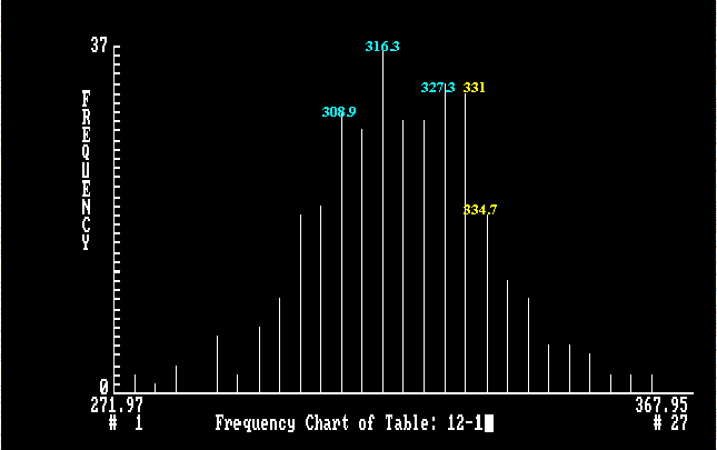
Monthly Cycle Frequency Chart of Comex-Gold
The frequency is a quantified value assigned by the system. The difference in frequency value of two adjacent bars indicates the ease with which the market is expected to move between these two prices. The smaller the difference, the easier is the movement.
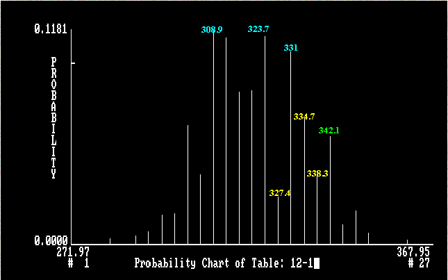
Monthly Cycle Probability Chart of Comex-Gold
The probability value measures the pull which a projected price exerts on the market. The likelihood of seeing a particular price level reached during a projected period is measured by a combination of two factors: the contour of the frequency chart and its probability value.
![[Most Recent Quotes from
www.kitco.com]](http://www.kitconet.com/images/quotes_7a.gif)
Quantum Index Analysis
The Quantum Index analysis is a new technical technique that I developed ten years ago. This technique is used to forecast the movement of currency rates, prices in bonds, stocks and precious metals. I provided exclusive service (USD/DEM, USD/JPY, USD/Swiss Franc and British Pound) to the Strategic Positioning Unit of Citibank in Hong Kong for two years (1988 - 1990). The system generates a bar chart for each of the above products. This chart indicates the ease of movement between projected chart points for a specific time frame. The system determines a projected range and number of bars to cover this range with a constant increment. The bars are arranged in ascending order along x-axis. A quantified value, frequency (y-axis), is assigned to each bar in the projected range. The difference in frequency value of two adjacent bars indicates the ease with which the market is expected to move between them. The smaller the difference, the easier the movement. The system also assigns a probability value (y-axis) to each bar. The probability value measures the pull exerted by each bar on the market. The likelihood of seeing a particular rate or price reached during any projected period is measured by a combination of two factors: the contour of the frequency chart and its probability value.

Albert Cheung (Ph.D.) E-mail: qindex@hotmail.com

Mirror Sites